Brand
The Netra name, its symbol and its wordmark, with files to download and the few rules for using them.
The symbol
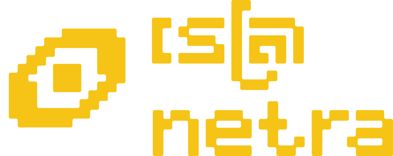
An eye, because netrais the Khmer word for “eye”. It leans up to the right the way the Cat’s Eye Nebula leans in the brand book: the name comes from the nebula, chosen for being beautiful, inspiring and powerful, and for resolving into the shape of an eye.
It is drawn on the same pixel grid as the wordmark, 15 pixels by 11, with the same rounded corners, so the two sit together as one drawing. The grid is how an OCR model reads a page: pixel by pixel, resolving structure out of an array of values.
The wordmark

The wordmark draws the word in the brand’s own square-grid letters, with “netra” in Latin beneath it.
The lab’s secondary imagery is the fishing cat, a small wild cat native to the region with some of the sharpest eyesight of any mammal, and a nod to the “cat” already hiding in Cat’s Eye Nebula.







Colour
Orange
Yellow
Maroon
Ink
White
Large areas take the soft tints of orange, yellow and maroon; the solid colours are kept for small doses.
Type
Newsreader
Kantumruy Pro
Using the logo
- Use orange on the white ground, yellow on maroon, or ink. No other colours.
- Keep it flat: no shadow, outline or gradient.
- Scale it evenly. Don't stretch, skew or rotate it; the lean is part of the drawing.
- Below 32px tall, use the small cut, which has fewer, larger pixels.
- Place it on the white ground or the maroon, not over a busy photograph.